Offshore Windfarm Assets / Academic Industry Cooporation
File
Wind Resources - Understanding Charts and Graphs
The energy output from a future wind farm can be derived from the wind data collected from the same area. While average wind speed provides an approximation of wind resource, more detailed and long term wind data measured from different heights can help in forecasting how much energy will actually be produced.
More analysis can be performed to understand about wind - such as wind speed variations and prevail wind directions. TGC has started a wind measurement campaign with its first met mast in Taiwan off the coast of Changhua county, and aim to contribute to the understanding about wind resources in Taiwan strait. Information about the met mast can be found here and summary reports about latest wind statistics can be found in the "Fuhai Met Mast Wind Data" section on the bottom left on this page. Here is one of the monthly report along with some brief explanations about the charts in the report.
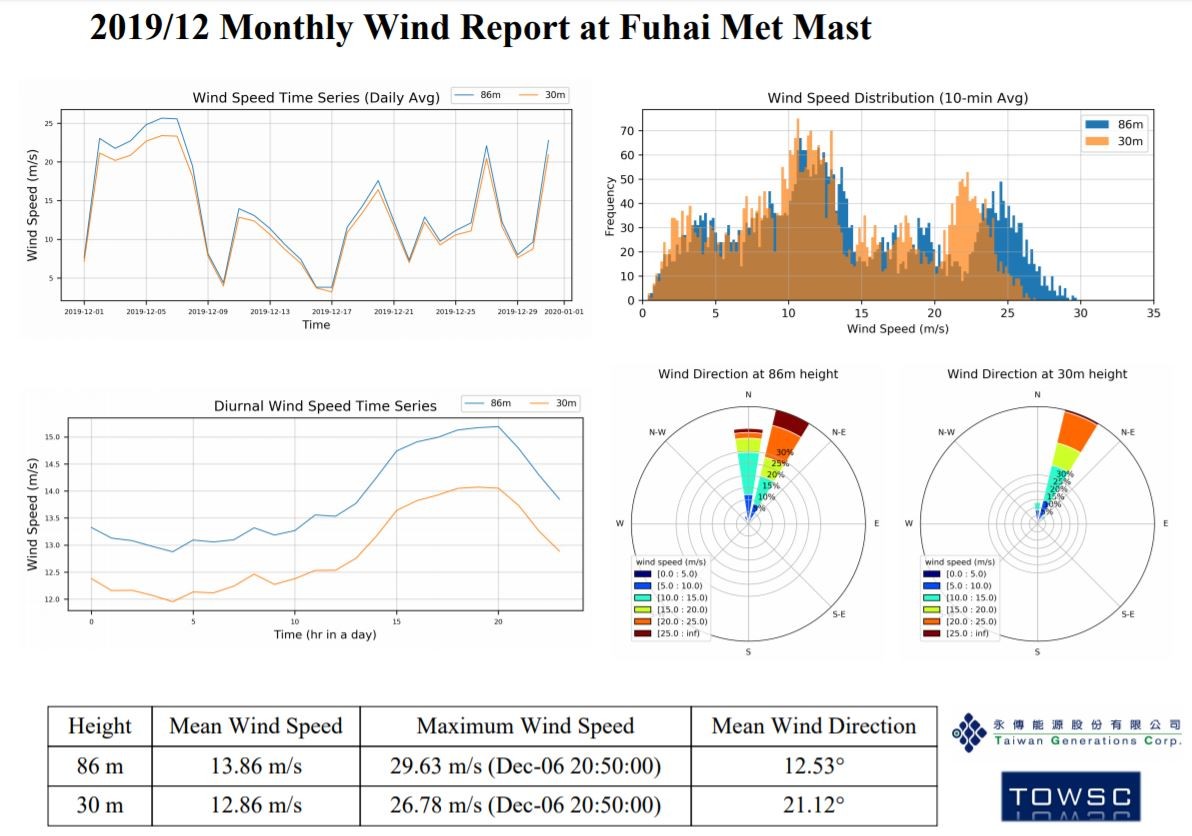
Wind Speed Time Series Graph - shows wind speed for an entire month and the change of wind speed as time progresses where trend (of wind speed) can be detected for near future
Wind Speed Distribution - number of times different wind speed occur during a month. This can provide an insight on the wind resource and is the basis to calculate the potential energy to be generated by wind turbine(s) at the location/area
Diurnal Wind Speed Time Series - shows the average wind speed at a certain time of day. Contrast in wind speed during the day and night can be seen in this type of graph
Wind Direction (Wind Rose) - visualisation of both wind speed and direction wind data for an entire month - it is also a good indication of the prevailing wind directions in the area, and a factor to consider in the design layout of a wind farm